top of page

Community Development Partnership
Art Direction
Print + Digital Design
Report Design
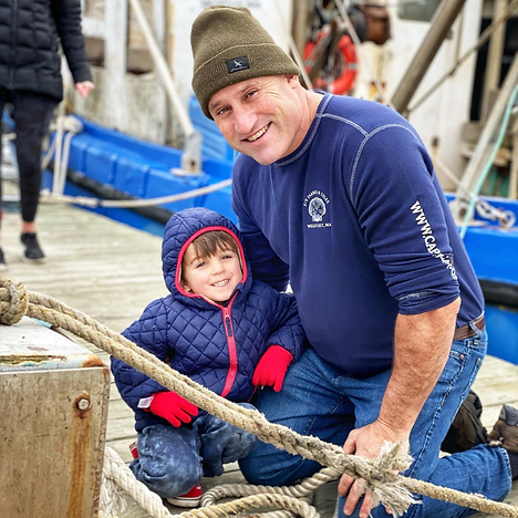
Rebranding a community resource to bring small business resources and affordable housing to Cape Cod
.png)
The Community Development Partnership (CDP) came to us seeking a cohesive brand system that better reflected its evolving mission on the Lower and Outer Cape and the breadth of its various programs. We developed a refreshed visual identity that unifies the organization while allowing each program—such as affordable housing and small business resources—to maintain its own distinct look within the system.
The new branding was implemented across digital and print materials, including their annual reports, e-newsletter templates, and program collateral. Through a modern color palette, updated typography, and consistent visual language, the rebrand strengthens CDP’s presence and helps communicate its ongoing impact in building a vibrant, year-round community.

.png)

.png)
.png)


bottom of page